When exploring ways to expand their conversion rate, many online sellers persistently neglect checkout pages and do not refine them. Yet optimal, page design can greatly decrease cases of cart abandonment and consequently enhance conversions. That is why it is so crucial for both small and large businesses.
According to the latest study, about 7 out of 10 consumers throw the carts away without concluding the bargain. This is quite a high rate which causes an immediate decrease in business. Marketers have to take a more proactive approach. Consider these ecommerce shopping cart best practices that will guide you through each step of strengthening the checkout page and explain how to reduce shopping cart abandonment.
What is the Average Rate for Cart Abandonment?
To make it clear, shopping cart abandonment belongs to a term in ecommerce describing a situation when the store visitors add the item or a few to a cart but leave the page without finalizing the purchase.
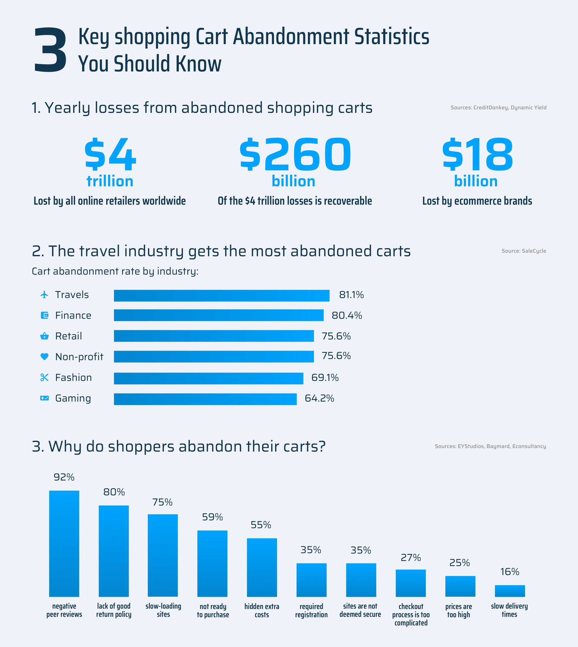
Abandoned shopping cart is a common case for online stores, and it is estimated at 68.53%. This percentage is obtained based on over 30 various researches conducted within the last ten years.
Even though the abandonment figure is high, it doesn’t completely illustrate the process of the user’s final decision. Studies are coming up with a hypothesis stating that adding an item to the cart demonstrates the user’s positive intention, so you don’t have to associate the abandoned cart automatically with a lost sale. One of the studies conducted by SeeWhy has proved that about ¾ of visitors plan to come back and conclude the order or keep browsing the store after dropping it off on their first visit.
The hypothesis also displays the complexity of the purchasing decision process, together with the fair amount of time it sometimes takes. Surprisingly, just 1% of potential clients make a buy when first visiting the site, whereas others need at least 5 more visits to finally complete the order. So, if your consumers throw away the carts, think of it as a new chance to get them back using multiple instruments like abandoned cart and remarketing emails, retargeting ads, etc.
Reasons for Shopping Cart Optimization
For the majority of ecommerce businesses, the high incidence of consumers abandoning the shopping cart is one of the biggest issues they go through. Over time, the volume of rejected carts continues to grow and is mostly caused by poor optimization of cart pages.
Although sellers can hardly monitor the organic abandonment from consumers who aren’t even close to buying, they still have an opportunity to enhance the cart design, accurately collect important data, and add helpful features that would encourage ready-to-buy consumers to finally proceed to checkout.
Before finding out what design changes should be made to make the checkout page more effective, let’s start with the essential elements applied to motivate consumers to complete the transaction. Here’s what they are:
The main CTA in the form of a checkout button
The exact product name and its details or specs
Product images
Stock availability
Subtotal and total price
Field for coupons
Details about discounts, gift certificates, and taxes
Forms of payment
Secure site seal
Warranty data
Delivery address, price, and date
“Continue shopping”, “add to bucket list”, and “save for later” buttons
Support line
Seller’s details
“Recommendations for” section, etc.
To get the most out of these elements, make sure to involve them sparingly according to your specific business needs, as well as keeping in mind the following tips.
The Effective Shopping Cart Page Design
The checkout page should be:
Clear and provide essential data on the same page to avoid long scrolling or redirecting to other pages.
Plain and communicate the data in simple terms to avoid confusion.
Fast and ensure minimal time for reviewing the order before proceeding to a checkout to discourage cart abandonment.
With these three steps and essential page components taken into consideration, you can build a shopping cart page that will lead consumers to checkout swiftly. Without being distracted by any unnecessary elements, they can promptly review the goods collected in the cart right before finalizing the transaction. Isn’t that a substantial reason to optimize the cart?
The Best Shopping Cart Examples
So, you’re running an ecommerce website and wondering how to go about designing the checkout page to convert visitors into loyal consumers? Consider the list below that contains the most inspirational shopping cart pages that will provide a clearer picture of how to make things right.
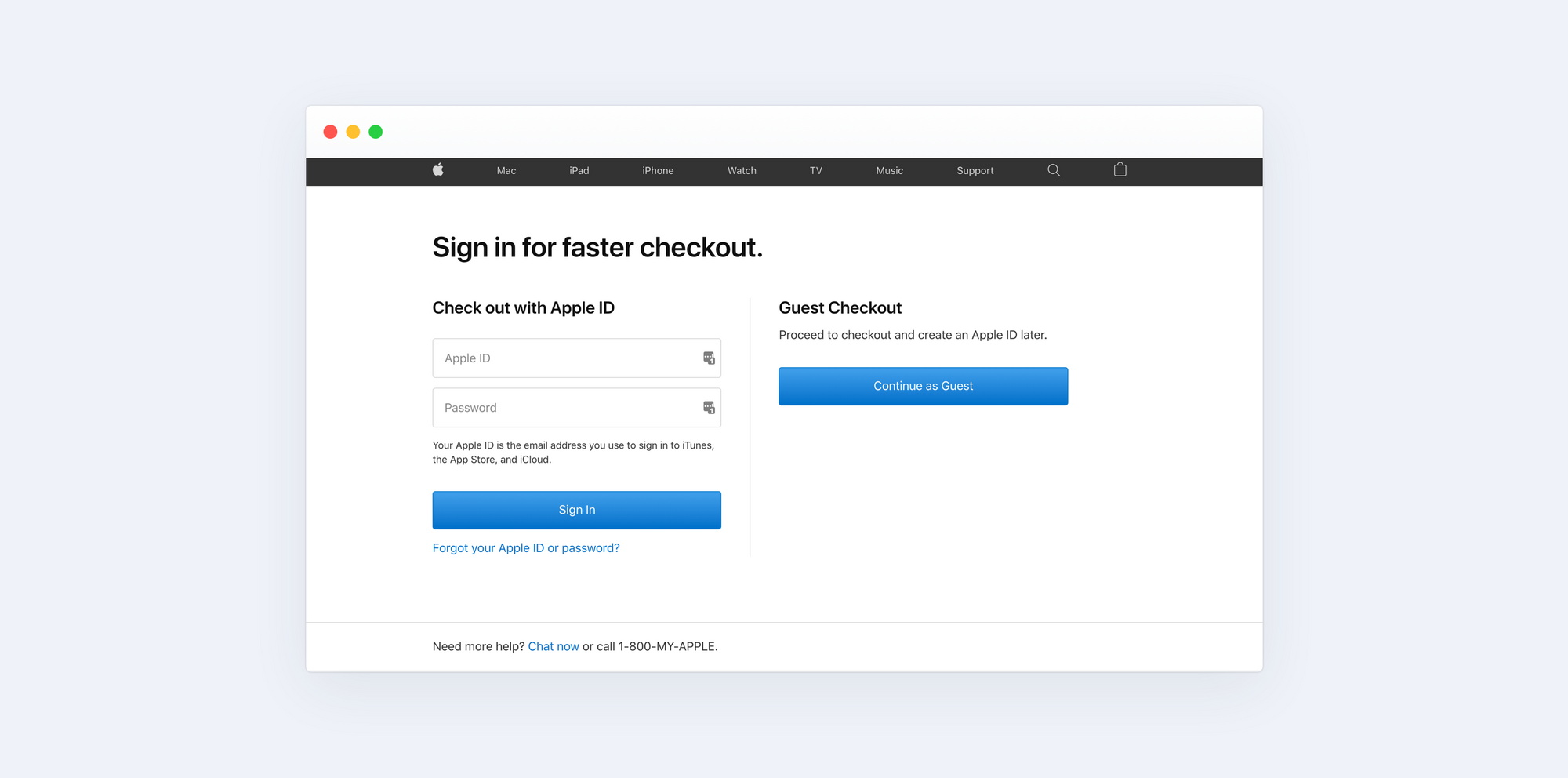
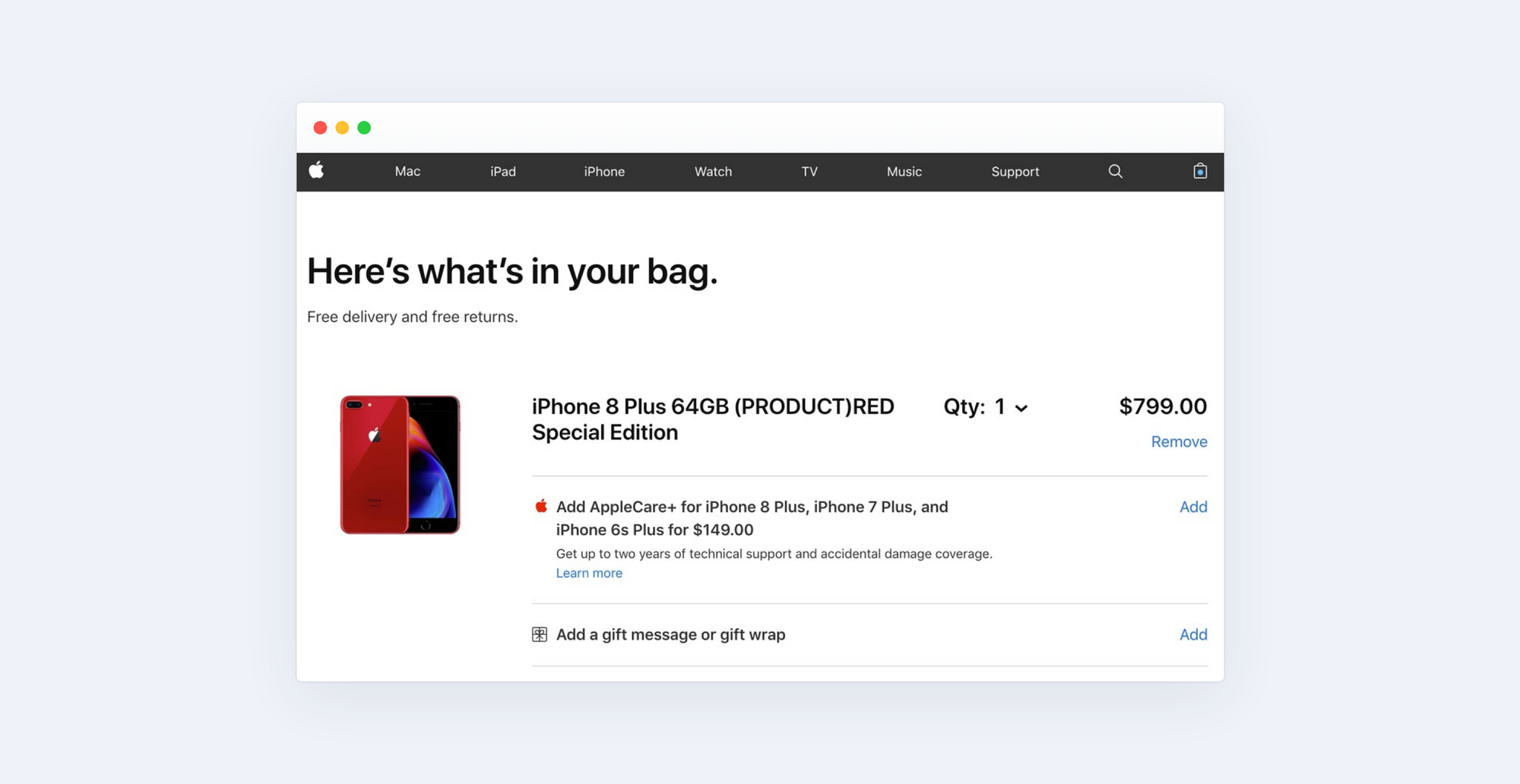
Apple Store
Apple is well known for its striving for minimalism, where the ‘checkout page’ is listed among other proofs of the company’s principles of website building. The page is well-designed and makes the most of the negative space that allows focusing on calls-to-action (CTAs). Additionally, the company offers guest checkout which is ideal for buyers who are not eager to register their details.
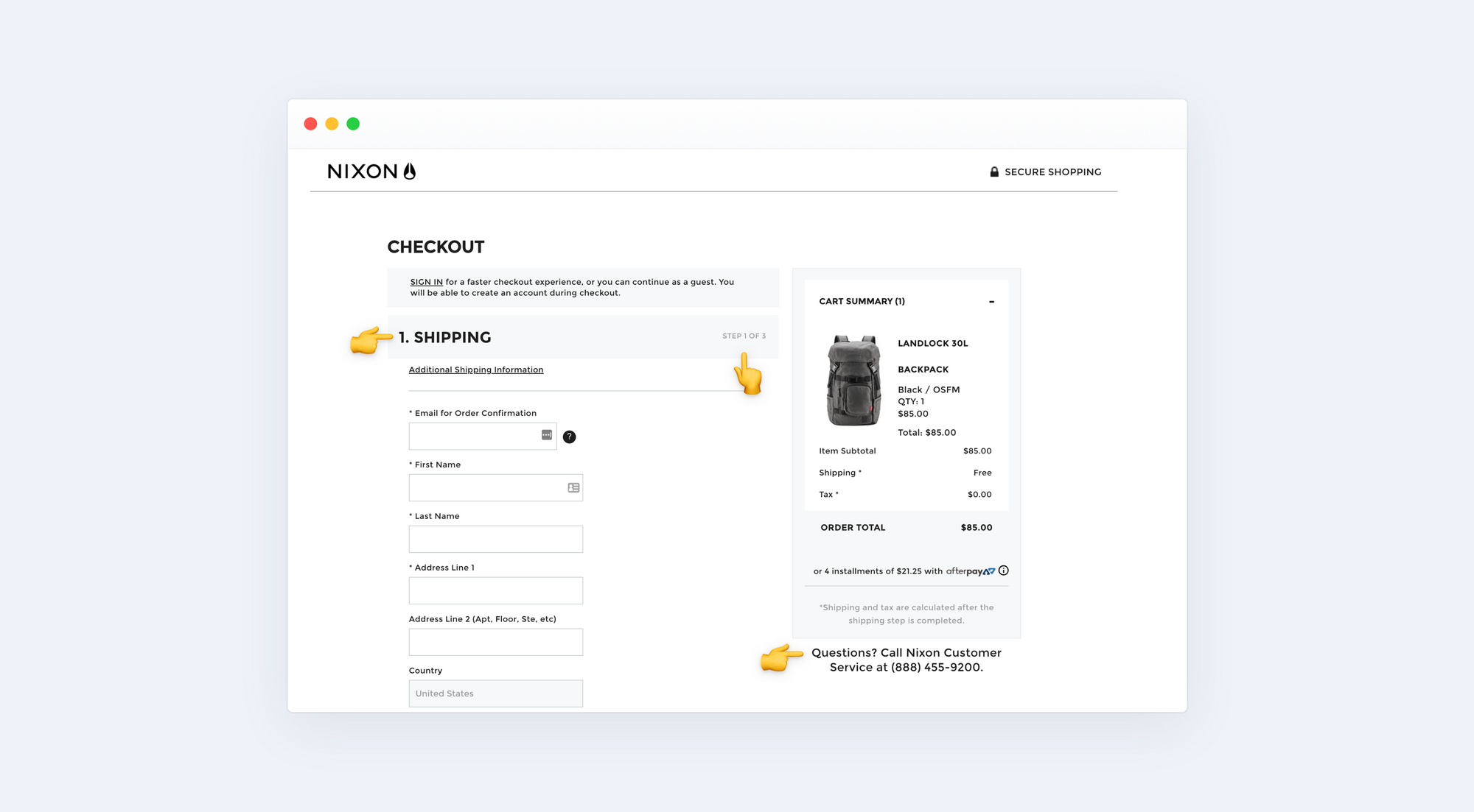
Nixon
Ecommerce websites should follow a good practice of Nixon online store. First, it allows for completing an order as a guest. Second, Nixon lets consumers be aware of how many steps are left to close the deal. Beyond the steps listed, the cart page contains customer service support.
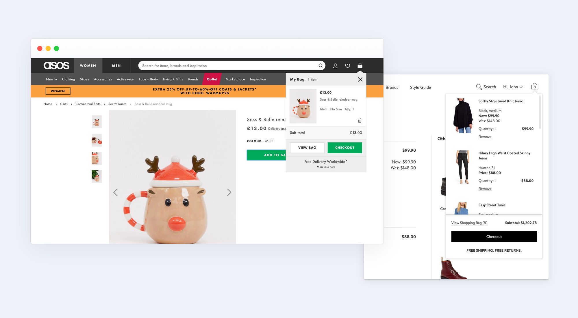
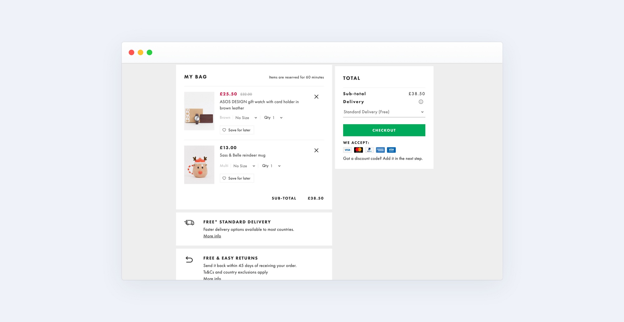
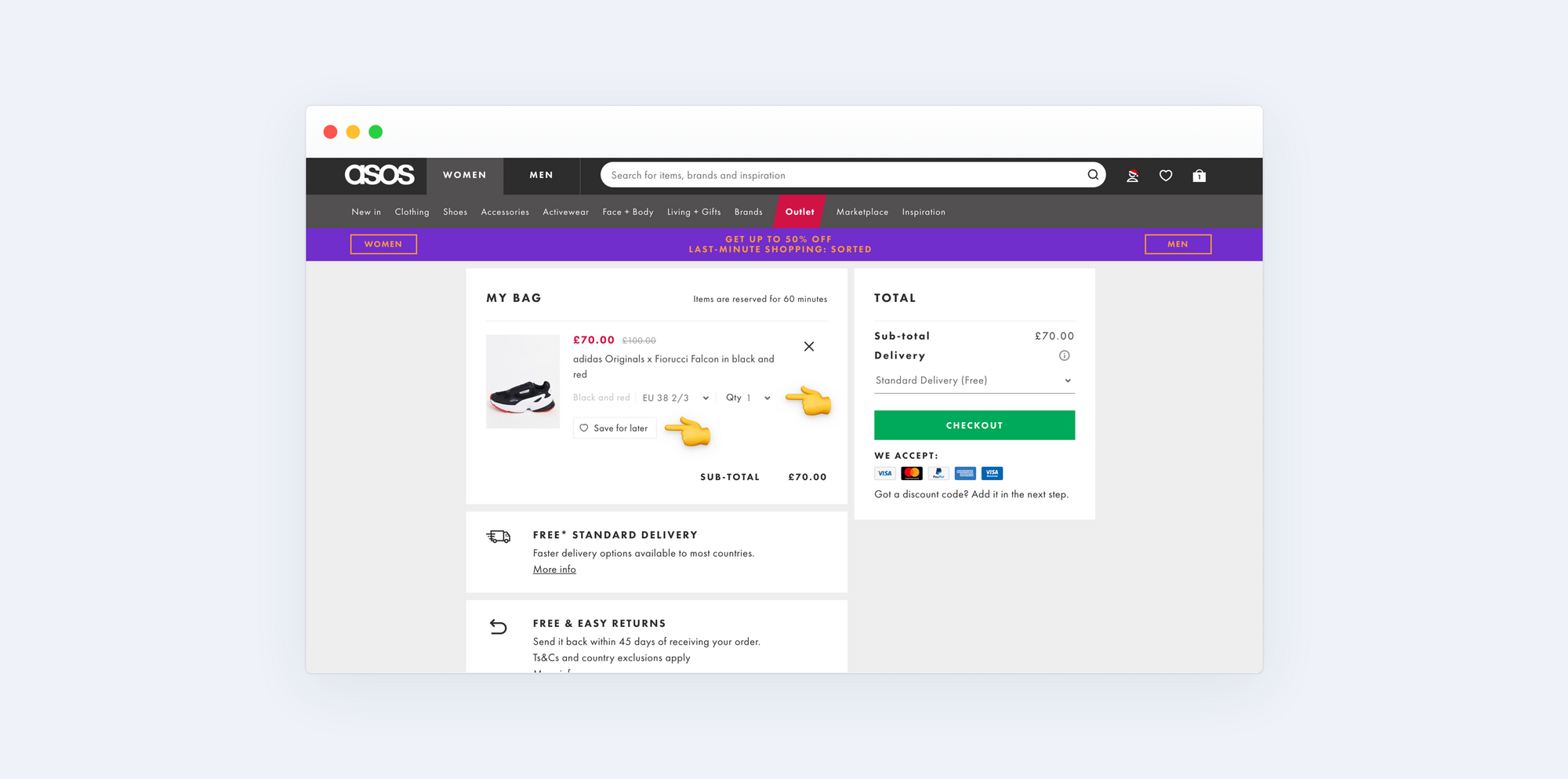
Asos, Nordstrom
Including a product brief on the cart page and even as a pop up throughout the site allows clients to see how much they will pay and what they are paying for. This feature is needed to keep clients confident that they will not be charged any additional fees in the final stage of ordering.
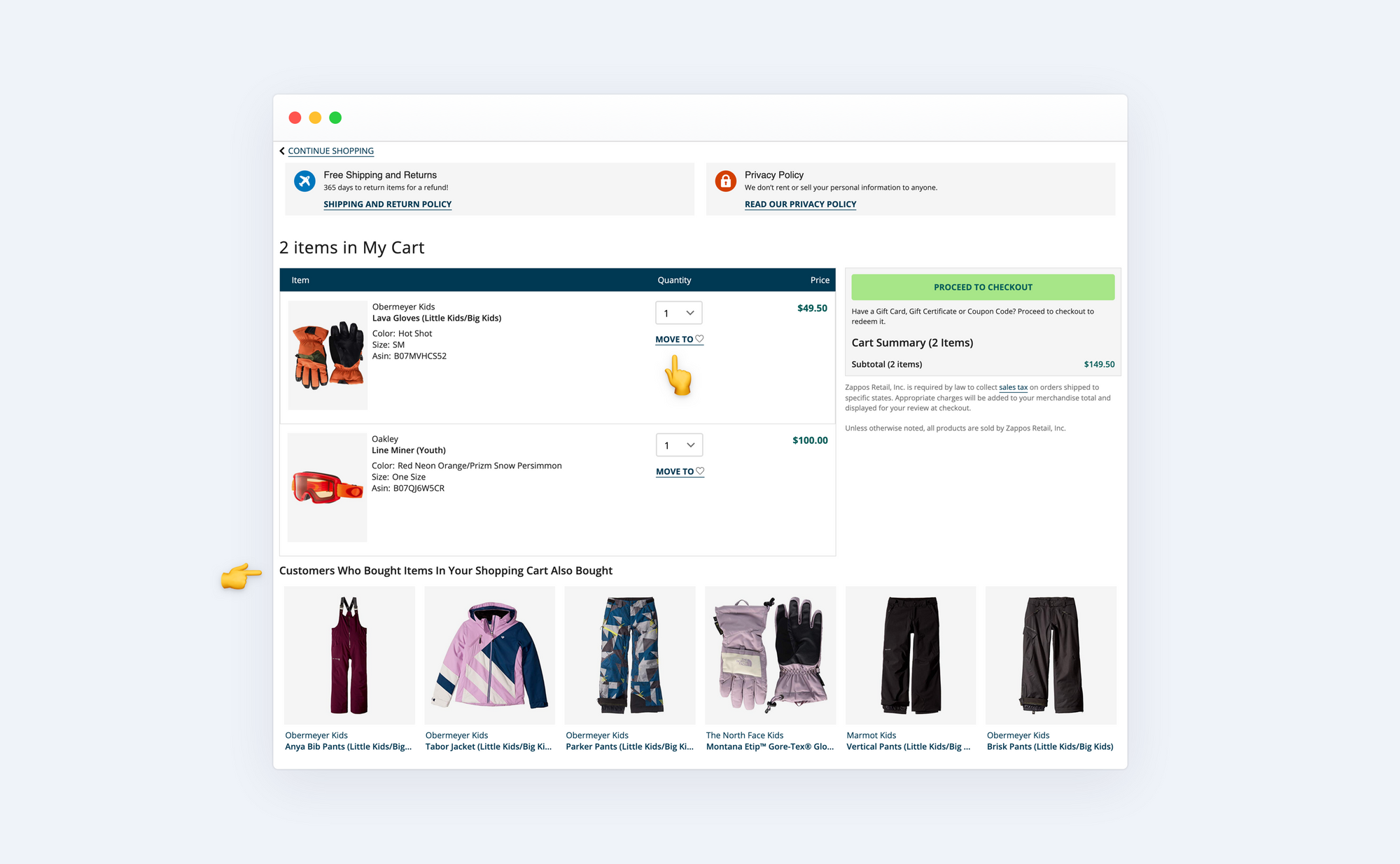
Zappos
Zappos’ online store boasts an outstanding checkout page design. It contains a “Move to Wishlist” option which allows consumers to save the products they like in folder for placing an order later. A “Customers also bought” section encourages clients to stay on the web page for longer by providing accompanying goods and inviting consumers to browse them. This is a great, converting practice that is usually underestimated.
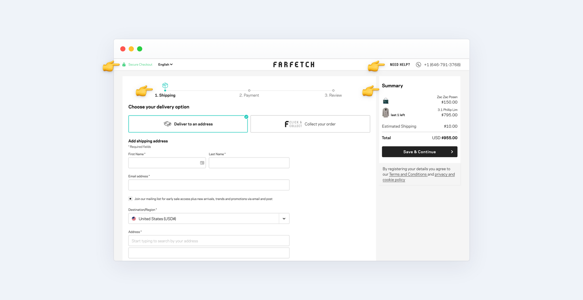
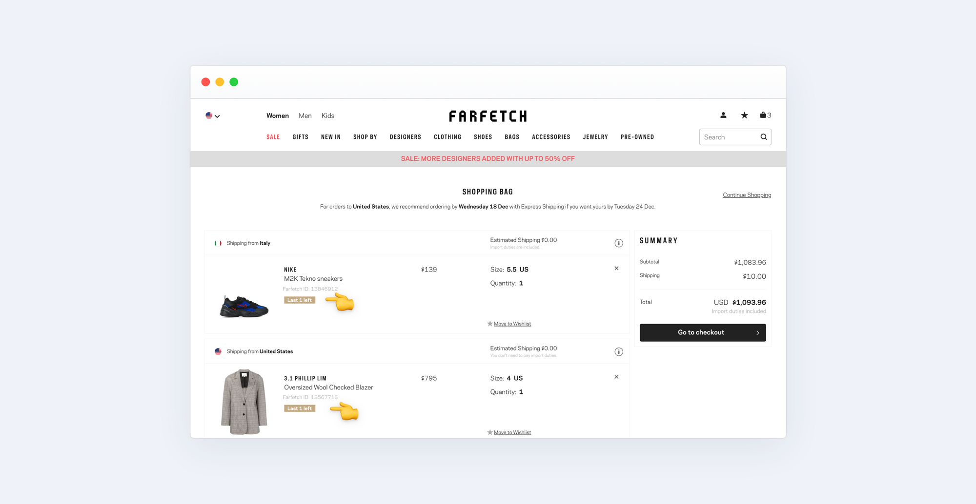
Farfetch
Farfetch combines several user friendly approaches described above. Its shopping cart page ensures security, displays the progress bar with upcoming steps needed to close the deal, shows a short summary of items and also provides support information.
Properly designed ecommerce shopping cart pages provide the relevant data to potential clients, make them confident in their purchasing decision, and consequently contribute to an increased conversion rate. So, if you strive to boost your ecommerce business, follow the example of the above - illustrated websites to optimize the shopping cart.
When is it Time to Optimize a Checkout Page?
You’ve just spent a fortune to get the online store ready for a busy shopping season, but are visitors still abandoning cart pages? This is a clear signal that something is going wrong on the website. If the pages load too slowly or the checkout process is too fast, you can continue to lose shoppers at any point of sale.
The total expenditure of rejected shopping carts for online sellers is roughly equal to $18 billion per year or even more. Of those leaving the cart, 18% attribute their abandonment to pages loading too slowly. That is to say, poor website performance leads to about $3 million of lost sales. This is too significant a problem to be neglected, thus it requires an urgent solution, such as page optimization.
If you are experiencing continuing abandonment of shopping carts at your store, consider shopping cart best practices that we will explain. They will show you how to optimize checkout pages and encourage clients to complete the transaction.
Best Practices for a Shopping Cart Page Optimization
Ensure a Detailed Order Brief
Most Internet buyers prefer to review the product they are going to pay for before closing the deal. Satisfy their needs by providing all the essential details about the item, such as:
product image
its name and attributes comprising color, size, specs, price, etc.
item quantity
delivery fee and coupon code field, etc.
When clients get all the needed data clearly provided on the checkout page, they can have a quick look at it and complete the order, which leads to a decrease in the volume of abandoned carts mostly caused by confusing data.
Leverage User-Friendly Color Code
Picking the colors for a website requires a multifaceted approach composed of an analysis of the target audience, brand, and the message you want it to convey. Nevertheless, most industries select more or less similar color codes for checkout pages. One thing to keep in mind when picking the color for a shopping cart is that users positively respond to a clear and balanced design.
Apply High Res Product Thumbnails
Miniature and barely distinguishable product thumbnails discourage the customer from making a deal with an ecommerce website. On the contrary, while taking care of thumbnail images, their size and resolution, you provide convenient viewing of items, as well as contribute to the better mobile UX.
Use Smart Data Hierarchy
Smart Data Hierarchy is important for providing product details based on their purpose. The use of buttons, titles, and non-competing CTAs together with lines and columns should be logical so that the page is organized in a way that fits a user’s perception. Pick about four colors matching the site to boost a user’s attention and emphasize a CTA.
Include a Variety of Payment Methods & Assuring Elements
Adding a great variety of payment methods is crucial in times of fierce competition. By accepting most payment methods, you cover as many consumers as possible, hence contributing to higher traffic volumes driven to the site. Users who find the payment method they trust will hardly want to leave your store.
Additionally, recent studies have proved that the absence of a trust seal results in increased numbers of abandoned carts. Meanwhile, including assuring elements on the website allows sellers to build a reliable business image and gaining the client’s loyalty.
Ensure Assistance
When there are human beings at work behind the site, buyers feel more confident about your business and are more likely to trust it. Thus, offering support by phone, chat, or email directly on the checkout page helps to win a customer’s goodwill.
Proceed with a “Continue Shopping” button
A “Continue Shopping” option is a tricky way that suggests customers abandon their carts without leaving the store.
Make Sure Shipping and Return Policy is Transparent and Detailed
Another top reason for rejected shopping carts is a hidden cost of delivery. Thus, making the delivery and return policy transparent is key to an improved conversion rate and customers’ loyalty.
Bear Cross-Selling Opportunity in Mind
Including complementary items inside the shopping cart is an approach you ought to undertake. Even though the optional goods are not aimed at increasing conversions, they do increase the average amounts customers spend in the store and lead to a higher revenue.
Consider Creating Urgency
When notifying clients in the shopping cart about the low level of stock availability, you create urgency and motivate them to proceed to checkout in hot pursuit.
Allow for Changing Size and Quantity of Products Inside the Cart
When it’s possible to adjust order attributes like size and number of products without leaving a checkout page, consumers save time and more readily close the deal.
Allow for Saving Items for Later
If you don’t want the potential consumers to leave the cart and never return to a store, include the “Save for later” option to the checkout page. This is an ideal alternative to deleting the whole order.
Allow for Deleting Products Directly from Cart
A lot of traders erroneously believe that depriving users of the ability to remove the item from the basket will reduce the abandonment of carts. The thing is that this approach works in the opposite direction and leads to a higher rate of abandoned pages.
Keep the Products in a Cart for About 30 Days
Set up the cart so that it holds the products of the unregistered customers for, ideally, 30 days. As mentioned earlier, the average consumer needs at least 5 site visits to make the final purchasing decision. Having the goods stored in the shopping cart will increase the chances of a completed transaction.
Display the Estimated Delivery Time
When consumers are notified about the estimated time span for delivery, they become less hesitant and are more likely to make a purchase at your store.
Set Up Automated Abandoned Cart Emails To Be Sent
A considerable number of carts are left long before the consumer completes the order. So, what to do with abandoned shopping cart? Set up automated emails to be sent that remind customers about the unfinished purchase. This is an effective instrument that allows you to get the consumers back to the store to close the deal.
Things to Avoid When Optimizing Shopping Cart Page
Given the huge number of articles covering the topic of checkout page optimization, one may have a hard time distinguishing between true and false data. This section aims to shed light on some of the recommendations for staying away from the land mines of optimization myths. So, let’s get to the main misconceptions that need to be avoided.
The customer forgets about the shopping cart. This is rather an exception that disproves the rule. To choose the best-suited approach for shopping cart optimization, it is mandatory to stick to the main reasons for cart abandonment, be it hidden expenses, complex checkout process, slow loading, the absence of assuring elements, or any other.
Optimizing the checkout page is challenging and costs an arm and a leg. The truth is that shopping cart optimization is not a piece of cake, as well as not being free. This is a complex process that requires a certain level of knowledge and investment. Nevertheless, an academic degree together with an annual budget is not necessary when one is dealing with optimizing the cart.
After learning all the practical guidelines and getting to know myths to avoid, you may still feel like you can’t cope with the process of checkout optimization. In that case, we recommend that you consider using specifically developed shopping cart programming or go to digital agencies like Zoolatech for help.
Here at Zoolatech, we have extensive experience in high-end software development and offer business product engineering, web and mobile app development, QA assistance, etc. Besides, we specialize in developing retail software solutions to ensure a converting shopping experience together with improved e-commerce systems. We know a lot about the pain called “shopping cart abandonment” and are ready to help you optimize the checkout page to stop losing clients, and gain higher conversion rates and revenue.
Wrap Up
The abandonment of shopping carts is an issue that most sellers face when running an ecommerce website. The number of users rejecting their carts is embarrassing and continually grows. Fortunately, cart abandonment is not a problem that cannot be fixed. There are a number of optimization practices aimed at helping to reduce abandonment and significantly enhance conversion rates.
Additionally, you can always count on agencies boasting expertise in the design of engaging and higher-converting checkout pages. While keeping these options in mind, you have many chances to boost an online business.