








Quick Summary
- Data observability is the continuous monitoring of data and pipelines that alerts a named owner. It tracks 5 pillars defined by Monte Carlo in 2020: freshness, distribution, volume, schema, and lineage.
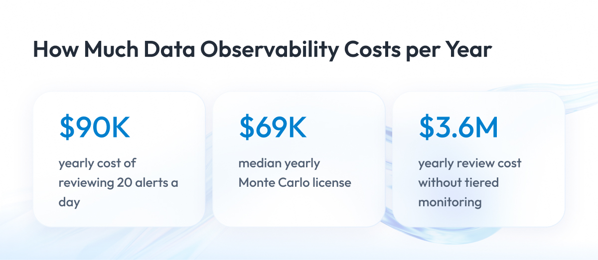
- Expect about $90,000 a year in engineer time to review 20 alerts a day. That exceeds the $69,000 median Monte Carlo license.
- Sort tables into three tiers and give the top 3% of tables 25 checks a day. For 642 tables, this cuts daily alerts from about 800 to 22.
- Plan a 90-day rollout that starts with Tier 1 tables and named owners. Tune alerts for 3–4 weeks before adding Tier 2 coverage.
- Start with dbt tests on Tier 1 tables and add a platform once manual rules fall behind. Platform deals above 300 tables often cost $120,000–$250,000+ a year.
This article continues our series on AI-ready data, and today we will talk about data observability.
Data observability is the practice of continuously monitoring your data and the pipelines that deliver it, so your team detects missing, late, or incorrect data before it reaches reports, dashboards, and other systems.
In an enterprise with hundreds of tables and many data sources, data errors are hard to notice. A table can stop updating or load only half of its rows, and the team often finds out only when a report shows wrong numbers. Turning on monitoring for every table at once creates another problem, because the team gets more alerts than it can review.
That is why we wrote this guide.
Below, we show how to set up data observability so the number of alerts stays manageable for your team. We cover the origin of the term, the five pillars, the difference from data quality or application monitoring, common failures, the Alert Budget, costs, a 90-day plan for how to implement data observability, metrics, open debates, and examples from our delivery work.
By the end of this article, you will know what data observability is, what it costs to run, and which tables your team should start with tomorrow.
What Is Data Observability, and Where Did the Term Come From?
In the introduction, we gave a short definition of data observability. Before we move on to tools, costs, and implementation, we need to look at the term more closely and see where it came from. The origin explains why vendors and engineering teams use the same words in slightly different ways today.
Data observability is the ongoing, automated monitoring of data and data pipelines that alerts a named owner when data arrives late, goes missing, changes structure, or contains incorrect values.
Each part of this data observability definition answers a practical question.
- What do you monitor? Your data, such as tables, files, and reports, and the pipelines that move it from source systems to the people who use it.
- How do you monitor it? Automated checks run continuously, on a schedule or each time new data arrives.
- Why do you monitor it? You want to find missing, late, or incorrect data early and notify the right person to fix it.
The most important word here is continuously. A one-time data audit tells you whether your data was correct on the day of the audit. Data observability tells you whether it is still correct today, after the latest load or the latest change in a source system.
The term itself is older than modern data platforms. Engineer Rudolf Kálmán introduced observability in control theory in 1960, and software teams adopted it decades later.
In software engineering, observability describes how well engineers can understand what happens inside an application from the data the application produces. According to the OpenTelemetry observability primer, teams usually rely on three types of output for this.
- Metrics, which are numbers such as response time or error rate.
- Logs, which are records of individual events.
- Traces, which show the path of a single request through the system.
In 2019, Barr Moses, co-founder and chief executive of Monte Carlo, applied the same idea to data. Monte Carlo sells a data observability platform, and industry sources credit the company with coining the term. Monte Carlo’s own account gives the date, and Dataversity’s overview of data observability confirms it.
In December 2020, Moses published the original article on the five pillars of data observability. This data observability framework is the version most articles still repeat today, and in the next section we look at each pillar and how the list has changed since then.
The Five Data Observability Pillars
In the previous section, we saw that Monte Carlo introduced the five pillars in 2020. Here, we explain what each pillar checks using simple examples, then show how the list has changed since then.
Each pillar answers one question about a table. The table below shows what each one checks and what a typical problem looks like.
| Pillar | What It Checks | Example of a Problem |
| Freshness | When the table was last updated | Hourly sales table last updated yesterday evening |
| Distribution | Whether values stay within their usual range | Share of empty email fields jumps from 2% to 30% |
| Volume | How many rows arrived | 40,000 orders loaded instead of the usual 400,000 |
| Schema | Columns and their data types | Source system renames customer_id to client_id |
| Lineage | Where data comes from and what uses it | Nobody knows which dashboards read the broken table |
The first four pillars help you notice that something went wrong. Lineage helps you see which reports and teams the problem affects.
Since 2020, the list has changed. Monte Carlo’s current guide replaces distribution with quality, and the word “distribution” no longer appears on that page at all.
The difference is practical. Distribution checks whether values look normal compared with their history. Quality is a wider term that covers any rule about correct data, such as “a discount cannot exceed 100%.”
Other sources did not follow the change. IBM’s page on data observability, which ranks first on Google for this topic in September 2026, still uses the 2020 list. Some vendors use their own lists.
| Source | Pillars It Lists |
| Monte Carlo, 2020 | Freshness, distribution, volume, schema, lineage |
| Monte Carlo, today | Freshness, quality, volume, schema, lineage |
| IBM | Freshness, distribution, volume, schema, lineage |
| Bigeye | Metrics, metadata, lineage, logs |
| Acceldata | Data quality, pipelines, infrastructure, users, cost |
For your team, this means the data observability pillars work as a checklist of signals. You can choose the ones that fit your data, because no single list is an industry standard.
The pillars also have limits. They tell you which signals to watch, and they say nothing about who responds to an alert, how many alerts your team can handle, or how much the monitoring costs. We cover these questions later in the article.
Before that, we need to separate data observability from two disciplines that people often confuse with it: data quality and application monitoring.
Data Observability vs. Data Quality vs. Application Monitoring
Now that we know what the pillars measure, the next question is how data observability fits next to the tools your company already has. Most enterprises already run data quality checks, and their engineering teams already use application monitoring. The three areas overlap, so teams often assume that one of them covers the others.
Each area answers a different question.
- Data quality sets rules for correct data, for example, “every order has a customer ID” or “a discount cannot exceed 100%.” Teams usually run these rules at fixed points, such as when data loads or before a report refreshes.
- Data observability continuously watches the whole data flow. It checks whether data arrived on time and in full, whether its structure changed, and which reports depend on it.
- Application monitoring, also called application performance monitoring (APM), watches software systems. It tracks response times, errors, and server load using observability data such as metrics, logs, and traces. In most companies, DevOps and site reliability engineering teams own it.
A simple example shows why one area cannot replace the others. Imagine your revenue dashboard receives sales data every night from 10 regional systems. One night, 4 of these systems fail to send their data, and in the morning the dashboard shows revenue 40% lower than usual.
Here is how each of the three areas reacts to this problem.
- Application monitoring stays silent. The servers and the dashboard itself work normally, so from its point of view nothing is wrong.
- Data quality checks stay silent too. They check each row that arrived, and every one is correct.
- Data observability raises an alert. It notices that far fewer rows arrived than on a normal night and shows which 4 regions are missing.
Only data observability catches this problem, because the problem is data that never arrived. The other two areas check only the data and systems that are in place.
| Aspect | Data Quality | Data Observability | Application Monitoring |
| Focus | Correctness of data values | Health of data and pipelines | Health of applications and servers |
| Main question | Is this data correct? | Is data arriving as expected? | Is the application working? |
| When it runs | At fixed checkpoints | Continuously | Continuously |
| Typical output | List of failed rules | Alert with affected tables and reports | Alert on errors, latency, or downtime |
| Usual owner | Data stewards and analytics teams | Data engineering or platform team | DevOps or site reliability engineering team |
The overlap between data quality and data observability is large, and some vendors even use the term data quality observability for tools that combine both. The Gartner Market Guide for Data Observability Tools (February 2026) still treats them as complementary categories, which means most companies need both.
Because the three areas sound similar, vendor descriptions and news headlines often mix them up. Before you choose a tool, check which of the three areas it covers.
Recent acquisitions show how easy it is to get this wrong. When Snowflake acquired Observe in early 2026, many articles described it as a data observability deal. Observe works with logs, metrics, and traces from applications and infrastructure, which puts it in application monitoring.
A data observability acquisition looks different. In April 2025, Datadog acquired Metaplane, a tool that monitors data tables and data lineage across a company’s data stack.
With these boundaries in place, we can look at the specific failures data observability detects and at how each check works.
Data Observability Use Cases
In the previous section, we saw that data observability catches problems other tools miss. Now let’s look at the most common data observability use cases, the failures data teams deal with every week. For each one, we explain what happens, how the check works, and what it costs to run.
1. Stale data
What happens. A sales table should update every hour. One night, the source system hangs, the table keeps yesterday’s data, and the morning report shows yesterday’s numbers as today’s.
How it gets detected. A freshness check compares the time of the last update with the expected schedule and sends an alert when the table is late. Apache Airflow, a popular tool for scheduling pipelines, can also warn you about late runs. Since version 3.1, it does this through Deadline Alerts, which replaced the older SLA (service level agreement) feature that many guides still describe.
What it costs. Very little, if you set it up right. dbt, a widely used tool for transforming data in the warehouse, can check freshness in two ways.
- If you point dbt to a timestamp column, it runs a query on the table, and you pay the warehouse for that query.
- If you leave that setting out, dbt reads the last change time from the warehouse metadata, which is almost free.
For hundreds of tables checked every day, this one setting makes a noticeable difference in your warehouse bill. The free option has one limit. It shows that the table changed, and it cannot show that the right data arrived.
2. Partial load
What happens. An orders table normally receives about 400,000 rows every night. One night, the connection drops halfway, and only 40,000 rows arrive. Every row is valid, so the table looks normal at first glance.
How it gets detected. A volume check compares the number of new rows with the usual range for that day of the week and sends an alert when the count falls far outside it.
What it costs. Low, because the warehouse already keeps row counts for each table.
3. Schema change
What happens. The team that owns the customer database renames the column customer_id to client_id. Every report that uses customer_id breaks or shows empty values.
How it gets detected. A schema check compares the current structure of the table with the previous version and sends an alert when a column is renamed, removed, or changes type.
What it costs. Low, because the check reads only the table description, not the data.
4. Distribution drift
What happens. A source system switches prices from dollars to cents, so a $25 item now appears as 2,500. Every value is still a valid number, so data quality rules pass, and the average order value in reports jumps 100 times.
How it gets detected. A distribution check compares values with their history, such as the average, the usual range, or the share of empty fields, and sends an alert when they shift sharply.
What it costs. Higher, because the check reads the actual values in each column. Most teams run it only on the columns that matter most.
5. Lineage gap
What happens. A table breaks, and nobody knows which reports and teams use it. The team spends hours finding out who is affected before it can start the fix.
How it gets detected. Lineage mapping records how data moves from each source to each report. OpenLineage, an open standard, collects this information from pipelines automatically.
What it costs. Mostly setup effort and very little warehouse compute.
Tools that cover these cases
Most teams combine several tools to cover all five cases.
- Open-source testing tools, such as dbt tests, Great Expectations, Soda, and Elementary
- Commercial data observability platforms, such as Monte Carlo, Bigeye, Metaplane, and Datafold
Together, these tools give you data pipeline observability, so you can see both the state of the data and the steps that moved it. If the same failures keep coming back, the pipeline design itself may be the problem. Our guide on how to rebuild a data pipeline explains when a redesign makes sense.
Each of these checks produces alerts, and every alert takes someone’s time to review. The next section shows how to estimate how many alerts your setup will produce before you turn it on.
The Alert Budget and What Monitoring 642 Tables Costs
Every check from the previous section can produce an alert, and someone on your team has to read each one. When a company turns on monitoring for every table at once, the number of alerts quickly grows past what anyone can review. The Alert Budget is a simple way to plan for this before it happens.
An Alert Budget is the number of alerts per day your team can review and act on, used to decide how many checks to run and on which tables before monitoring goes live.
To show how it works, we use a typical company. In a 2023 survey of 200 data professionals, Wakefield Research and Monte Carlo found that respondents had an average of 642 tables.
Two ways to monitor 642 tables
The first option is to check every table the same way. If each table has 50 columns and each column gets 5 checks every day, the company runs 1,123,500 checks a week.
The second option is to split tables into tiers by how important they are and to check each tier differently.
- Tier 1 covers about 3% of tables, or 19 tables, that feed executive reports and revenue figures. Each one gets 25 checks a day.
- Tier 2 covers about 15% of tables, or 96 tables, that business teams use every day. Each one gets 13 checks a day.
- Tier 3 covers the remaining 82%, or 527 tables. Each one gets 5 basic checks a day, such as freshness, volume, and schema.
This setup runs 30,506 checks a week, 37 times fewer than the first option.
Some checks fire even when nothing is wrong. There is no published figure for how often this happens with data checks, so we use 0.5% as an example, which means one false alarm for every 200 checks. We also assume that reviewing one alert takes 15 minutes.
| Same checks on every table | 1,123,500 | About 800 | About 200 hours |
| Checks split by tier | 30,506 | About 22 | About 5.5 hours |
With the first setup, reviewing alerts would take about 25 full-time engineers. With the second, it takes less than one. A different false alarm rate changes both numbers, and the gap between them stays the same, because the tiered setup runs 37 times fewer checks.
The tiered result is close to what teams see in practice. SYNQ, a data observability vendor, studied alerts at 12 scaleups over 10 days and found an average of 20 alerts per day. In one of the larger teams from that study, more than 60% of the issues were repeats of the same alert, and 30% stayed open for all 10 days.
So a large share of alert volume is the same problem reported again and again. Grouping repeat alerts and giving each one a clear owner reduces the load as much as cutting checks does.
Build your own Alert Budget
You can repeat this calculation for your own warehouse in a few minutes. Two numbers in our example are assumptions: the checks per table and the false alarm rate, because no published averages exist for either. Replace them with your own numbers where you have them.
| Tables in your warehouse | 642 |
| Tier 1 tables × checks per table per day | 19 × 25 |
| Tier 2 tables × checks per table per day | 96 × 13 |
| Tier 3 tables × checks per table per day | 527 × 5 |
| Checks per week | 30,506 |
| False alarm rate | 0.5% |
| Alerts per day | About 22 |
| Minutes to review one alert | 15 |
| Review hours per day | About 5.5 |
Compare the last line with the time your team can spend on alerts each day. If your number is higher, reduce checks on Tier 3 tables first or move some tables to a lower tier.
Review time is only one part of the cost. The next section adds the other costs and compares them with the price of a monitoring platform.
The Economics of Data Observability
The previous section showed how many hours your team spends reviewing alerts. In this section, we put a price on those hours and compare the total with what a data observability platform costs. For most teams, the result changes how they plan the budget.
Engineer time versus the license
To price engineer time, we start with salary data. According to Built In, the average total compensation of a data engineer in the US is $150,234 a year. With 2,080 working hours in a year, one hour of an engineer’s time costs about $72.
Next, we take the alert volume that SYNQ measured, which we covered in the previous section: 20 alerts a day. If each alert takes 15 minutes to review, the team spends 5 hours a day on alerts, or 1,250 hours over 250 working days.
Now compare that with the price of a platform. Vendr, which tracks software purchase prices, reports that the median Monte Carlo buyer pays $69,000 a year, based on 77 purchases.
| Reviewing 20 alerts a day | 5 hours × 250 days × $72 | About $90,000 |
| Monte Carlo license, median | Vendr data from 77 purchases | $69,000 |
For a team with 20 alerts a day, the time spent on alerts already costs more than the median platform license. With the untiered setup from the previous section, about 800 alerts a day, review time would cost about $3.6 million a year, the equivalent of 25 full-time engineers.
Large companies pay more for licenses too. Vendr reports that enterprise deployments with more than 300 tables often cost $120,000 to $250,000 or more a year. The difference is that you negotiate the license once, while the cost of alert review depends on how you set up monitoring, which your team controls every day.
Costs that pricing pages leave out
The license and review time are the two highest costs, and several smaller ones add up next to them. Vendr advises budgeting an extra 15% to 25% on top of the base subscription for onboarding, support, and warehouse compute.
| Warehouse compute | Monitoring queries run on your paid warehouse | Use metadata-based checks where possible |
| Data transfer | Data or metadata copied to the vendor’s cloud | Check what the tool copies out |
| Onboarding | Connecting sources, configuring rules and lineage | Start with Tier 1 tables only |
| Ongoing tuning | Engineers who adjust checks and own alerts | Assign owners before rollout |
Three ways to pay for data observability
Once you see the full cost, the decision looks different. You are choosing how to split money between a license and engineering time, and there are three common options.
- Buy a platform. You get the fastest start and pay for the license plus the time to tune it.
- Build on tools you already have. Many teams start with dbt tests, Great Expectations, or Soda and add their own alert routing. There is no license, and the engineering time is higher.
- Add people. Sometimes the missing piece is ownership. Two data engineers who own checks and alerts can solve more than a new tool, and you can hire them or bring them in through team extension.
The right option depends on the number of tables, your team’s skills, and how fast you need results. If you want an outside view, our data analytics consulting services team runs this kind of analysis before choosing any tool.
Whichever option you choose, the rollout order decides how many of these costs you actually pay. The next section shows how to implement data observability in the first 90 days.
How to Implement Data Observability in the First 90 Days
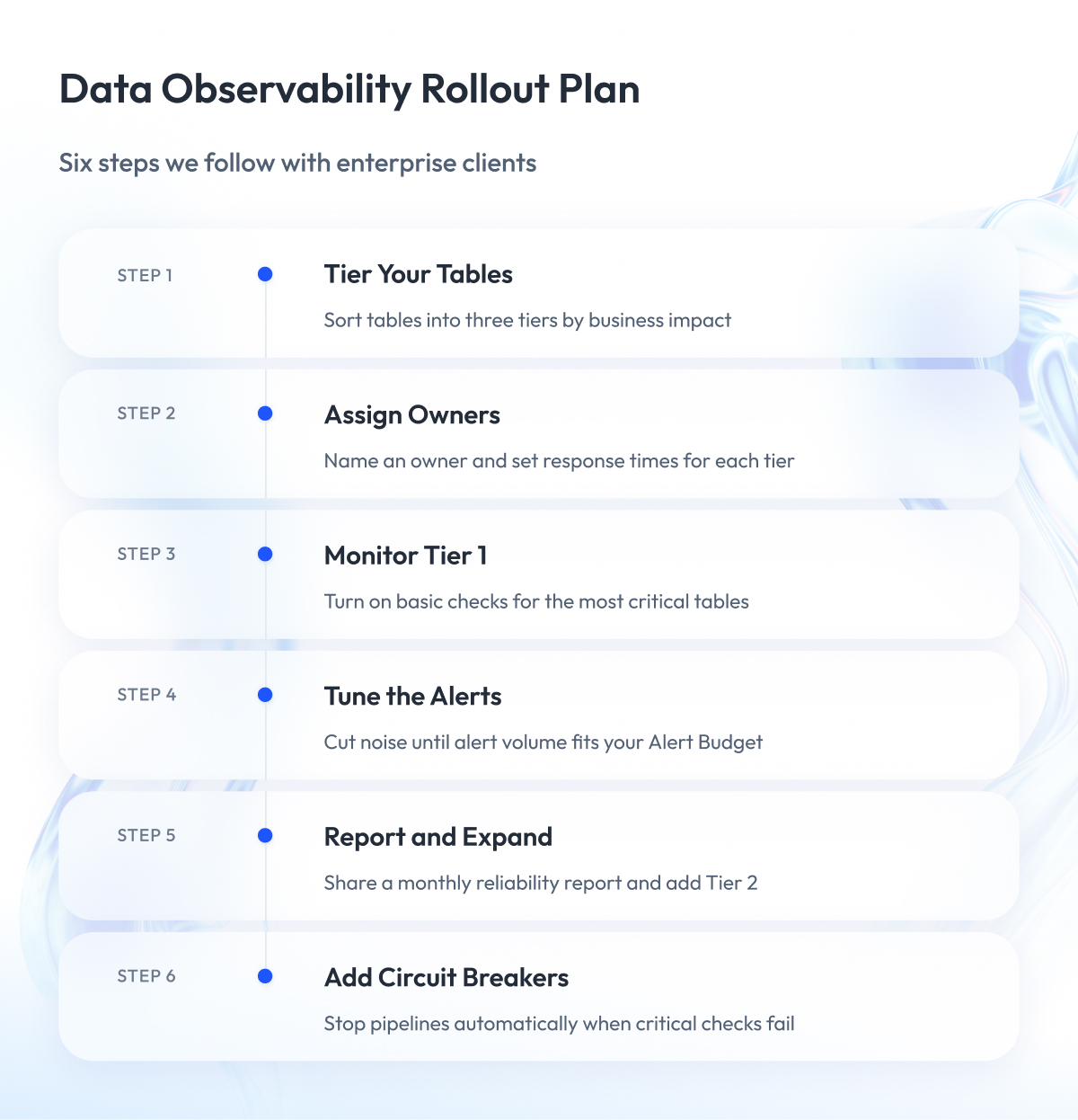
The previous sections showed what data observability catches, how many alerts it produces, and what it costs. Now we turn this into a plan. Below is the 90-day plan we follow with enterprise clients, where each step builds on the last.
| Weeks | Step | Result |
| 1–2 | Tier your tables | Every table marked as Tier 1, 2, or 3 |
| 2–3 | Assign owners | Named owner and response times for each tier |
| 3–6 | Monitor Tier 1 tables | Checks running on the most critical tables |
| 7–10 | Tune the alerts | Alert volume within your Alert Budget |
| 11–13 | Report and expand | Monthly reliability report, Tier 2 coverage started |
| After 13 | Add circuit breakers | Pipelines stop bad data automatically |
Step 1 – Tier your tables before you add any checks
We start every engagement by listing the client’s tables and sorting them by importance. We use a rule similar to the one Uber published. Data that affects compliance, revenue, or brand goes into Tier 1 or Tier 2.
We usually work with three tiers.
- Tier 1 covers tables that feed executive reports, revenue figures, or regulatory reporting.
- Tier 2 covers tables that business teams use every day.
- Tier 3 covers everything else, including staging and one-off analysis tables.
When Uber applied its rule, about 2,500 of its more than 130,000 tables ended up in the top two tiers, less than 2%. In our projects, the critical set is also small compared with the whole warehouse. This lets the team protect it well without monitoring everything at the same level.
Step 2 – Assign a named owner to every tier
Before we turn on any checks, we agree with the client on who owns each Tier 1 table. That person receives the table’s alerts and decides what to do. A shared channel where everyone sees an alert and nobody acts on it is the most common gap we find when we review a client’s monitoring.
We also agree on response times. A good starting point is the set of targets that GitLab publishes for its data team, which we then adjust to each client’s business.
| Severity | Time to Respond | Time to Mitigate | Time to Resolve |
| Sev1 | 2 hours | 1 day | 7 days |
| Sev2 | 4 hours | 3 days | 30 days |
| Sev3 | 24 hours | 7 days | 60 days |
To respond means someone starts working on the problem. To mitigate means a temporary fix stops further damage. To resolve means the data is fully correct again and the reports that use it are up to date.
Step 3 – Start with executive reporting and revenue tables
We turn on checks for Tier 1 tables only. The starting setup usually includes the following.
- Freshness, volume, and schema checks on every Tier 1 table.
- Distribution checks on the columns that feed key business numbers.
- Alerts sent directly to the table owner.
- Check results stored for the monthly report.
At this stage, the data observability architecture stays simple, and the small scope keeps alert volume low while the client’s team learns how the checks behave.
Step 4 – Tune before you expand
For three to four weeks, our engineers review every alert together with the table owners and decide whether it pointed to an actual problem or a false alarm. We adjust thresholds, remove checks that produce noise, and group recurring alerts.
We move on to Tier 2 tables only when the Tier 1 alert volume fits within the team’s Alert Budget. If coverage expands earlier, the noise grows faster than the team’s trust in the alerts.
Step 5 – Report reliability every month
Once a month, we prepare a short report for the people who use the data. It shows the number of incidents by tier, how long it took to detect and resolve them, and the share of Tier 1 tables that have checks and an owner. This report keeps the program visible to the business and helps the data team defend its budget. In a later section, we cover which of these metrics have published benchmarks.
Step 6 – Add circuit breakers last
A circuit breaker is a rule that stops a pipeline when a critical check fails, so bad data never reaches reports. It works like the quality gates DevOps uses to stop a faulty software release.
We add circuit breakers only after tuning. If a check still produces false alarms, a circuit breaker will stop a healthy pipeline and delay correct data.
The mistake to avoid
The most common mistake we see is rolling out a heavy process across all data before the team has tested it on a small set. Airbnb went through this with its Midas certification process, introduced in 2020. Each critical dataset had to pass four separate reviews, and the process proved too heavy to scale. Airbnb later added a data quality score that could cover far more datasets with less effort.
That is why our plan starts with the few tables that matter most and expands only when the process works on them.
Data Observability Metrics and Which Ones Have Benchmarks
In Step 5, we recommended a monthly reliability report. The next question most data leaders ask is how their numbers compare with other companies. For most data observability metrics, there is no reliable answer yet, and it helps to know this before you set targets.
Software engineering has a standard for this. DORA, short for DevOps Research and Assessment, is a research program that defines four key metrics for software delivery and publishes benchmarks in its annual reports.
Data engineering has no equivalent. There is no agreed set of metrics, no independent research program, and no annual benchmark that compares data teams with each other.
| Metric | What It Shows | Published Benchmark |
| Time to detect an incident | How fast the team learns about a problem | Vendor surveys only |
| Time to resolve an incident | How long until data is correct again | Vendor surveys only |
| Incidents per month | How often data breaks | Vendor surveys only |
| Share of Tier 1 tables with checks | How much critical data is covered | None published |
| On-time data delivery rate | Share of loads that arrive on schedule | None published |
| Data downtime | Total hours data was missing or wrong | None published |
The figures that do exist come mostly from one source, the annual data quality surveys that Wakefield Research conducted for Monte Carlo. They are useful as rough context, and the numbers inside them do not always match from one year to the next.
- The 2022 survey of 300 data professionals reported about 61 incidents per month, and about half of respondents said resolving an issue took nine hours on average.
- The 2023 survey, which we cited earlier, reported 59 incidents per month for 2022 and a 166% increase in time to resolution, to 15 hours. That increase implies a 2022 starting point of about 5.6 hours.
The two reports describe the same year with different numbers, and neither explains the gap. For your team, this means the most reliable benchmark is your own history. Measure the same numbers every month, track the trend, and treat outside figures as background.
Metrics are only one area where the field has no agreed answer. The next section covers several others where practitioners openly disagree.
Where Data Practitioners Still Disagree
Throughout this guide, we have shared our own positions. It also helps to know where experienced practitioners disagree, because these debates affect what you buy and how you organize the team. Three of them come up often in our client conversations.
Existing tests or a platform
One group argues that dbt tests and open-source tools cover most needs, as long as someone owns them. Their main argument is cost, because these tests run on infrastructure the company already pays for.
Vendors of data observability platforms argue that tests catch only the problems someone thought of in advance. A platform learns each table’s normal behavior and flags changes nobody wrote a rule for.
Both sides are right about different problems. In our projects, we start with tests on Tier 1 tables and add a platform when manual rules can no longer keep up with the number of tables.
Data contracts
A data contract is a written agreement between the team that produces data and the teams that use it. It describes the data structure, what each field means, and how fresh the data must be, and tools can check these rules automatically.
Contracts can work well. Miro reports that contracts helped cut the downtime of a key pipeline from 50% to nearly 1% over several quarters. The same team also found it hard to agree on quality standards with every data consumer in the company.
Chad Sanderson, one of the best-known advocates of data contracts and the founder of Gable, a company that sells data contract tools, wrote in 2023 that contracts defined only by the producing team often fail in practice. In his view, most companies lack the organizational maturity this approach requires, so he recommends starting from what data consumers need.
AI in data observability
Most platforms now promote AI features, such as suggested checks and automatic root-cause analysis. Data teams remain cautious. In the 2026 State of Analytics Engineering Report by dbt Labs, 72% of respondents prioritize AI-assisted coding, while only 24% prioritize AI-assisted pipeline management, which includes testing and observability.
In the same survey, 71% said they worry that incorrect or hallucinated data will reach stakeholders. In our projects, the table owner reviews every AI-suggested check before it goes live.
These debates will continue for some time. Results are easier to judge on actual projects, so the next section shows what data observability looks like in our delivery work.
What Data Observability Looks Like in Our Delivery Work
This guide’s approach comes from our own projects. Below are four engagements where our teams built monitoring, alerting, or observability for enterprise clients.
Zalando customer data pipeline
For Zalando, our team built a real-time customer data pipeline and established data SLOs (service level objectives), anomaly detection, and monitoring. The pipeline processes about 2.5 billion records per day and centralized 4 billion client IDs over three years.
- More than 50% reduction in processing costs.
- €4.5M projected potential GMV (gross merchandise value) uplift.
Job tracking for a construction platform
We built observability for background job processing on the client’s platform, with metrics at the queue and job level. A team of three engineers delivered the project.
- Zero vanishing jobs, with every job traceable end to end.
- Root-cause investigations cut from hours or days to minutes.
- Queue- and job-level metrics that made meaningful SLOs possible.
Alerting for a finance marketplace
Our team of two engineers integrated SumoLogic, Datadog, and PagerDuty into one path from detection to escalation. We also moved alert definitions into version-controlled code and deployed them through Jenkins with rollback so that every alert change can be reviewed and reversed.
This centralized monitoring and alerting setup makes alert tuning safe, which is the core of Step 4 in our 90-day plan.
Monitoring for a European retailer
As part of release management on Azure, our team set up monitoring with Azure Monitor, New Relic, and OpenTelemetry.
- 99.999% availability.
- Up to 7x lower metric-storage costs.
- Rollback in under one minute.
You can find more examples in our data analytics case studies.
Final Word
Setting up data observability takes more work than most product demos suggest. You have to sort hundreds of tables by importance, agree on owners with teams that already have full calendars, and tune checks until every alert means something.
This work pays off.
A well-tuned setup lets your team find broken data before business users do and keeps alert review to a few hours a day. A rushed setup costs the license fee plus hundreds of engineering hours, and eventually the business stops trusting its own reports.
If you have read this far, you already know the trade-offs, so the next step matters most. This week, list your tables, mark the ones that feed executive and revenue reporting, and fill in the Alert Budget worksheet for them. The result will show whether you need a platform, better use of
the tests you already run, or more people.
If you want an outside review, Zoolatech is ready to look at your warehouse, help you sort tables into tiers, and estimate your Alert Budget before you commit to any tool.
Questions You May Have
What is data observability?
Data observability is the continuous, automated monitoring of data and data pipelines that alerts a named owner when data arrives late, goes missing, changes structure, or contains incorrect values.
What are the five pillars of data observability, and who defined them?
The five data observability pillars are freshness, distribution, volume, schema, and lineage, which Barr Moses of Monte Carlo published in 2020 and which the company later revised by replacing distribution with quality.
How is data observability different from data quality?
In the data observability vs data quality comparison, data quality checks whether values follow set rules at fixed points, while data observability continuously watches whether data arrives on time, in full, and with the expected structure.
Do you need a platform, or will dbt tests do?
Most teams can start with dbt tests on their most critical tables and add a data observability platform only when manual rules can no longer keep up with the number of tables.
How much does data observability cost?
For a team that reviews 20 alerts a day, review time costs about $90,000 a year, which is more than the $69,000 median Monte Carlo license that Vendr reports.
How do you implement data observability without alert fatigue?
You avoid alert fatigue by tiering your tables, assigning an owner to each tier, starting with Tier 1 tables, and tuning alerts until their volume fits your Alert Budget before you expand coverage.
What is a data observability framework?
A data observability framework is a set of signals to monitor, such as the five pillars, and it works best when you combine it with named owners, agreed response times, and an Alert Budget.
What does data pipeline observability cover?
Data pipeline observability covers both the state of the data and the steps that moved it, so your team can see whether each load ran on time and delivered complete, correctly structured data.What does data pipeline observability cover? Data pipeline observability covers both the state of the data and the steps that moved it, so your team can see whether each load ran on time and delivered complete, correctly structured data.
What does a data observability architecture look like?
A basic data observability architecture runs checks inside the warehouse. It sends each alert to the affected table’s owner, while lineage links every table to the reports that depend on it.
What is data quality observability?
Data quality observability is a term some vendors use for tools that combine rule-based data quality checks with continuous monitoring of freshness, volume, schema, and lineage.